The Evolution of Responsive Web Design: From Desktop to Mobile
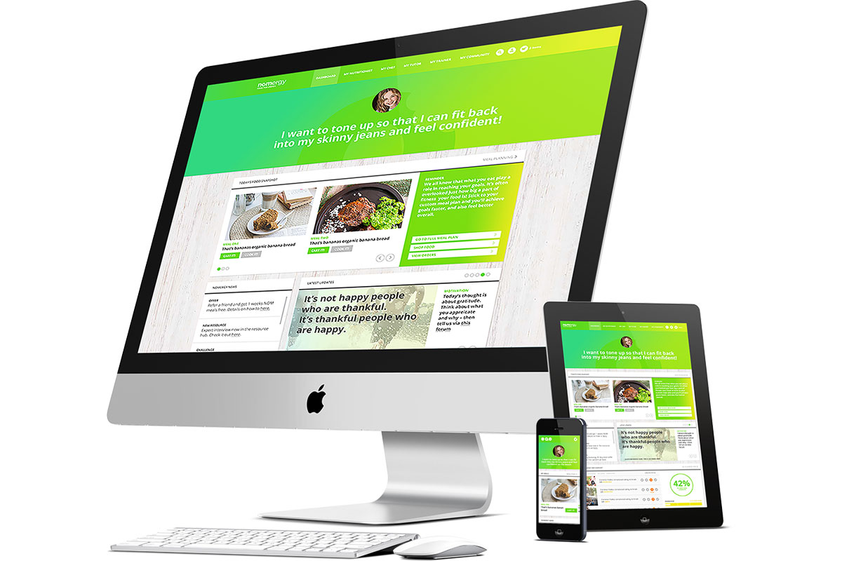
The evolution of responsive web design has dramatically transformed how websites are created and viewed. In the early days of the internet, websites were primarily designed for desktop computers, resulting in static layouts that often failed to adapt to varying screen sizes. As mobile devices gained popularity, designers faced the challenge of creating separate mobile versions of their sites, leading to increased development time and costs. The introduction of responsive design techniques changed the landscape, allowing web developers to build fluid grids and flexible images that automatically adjust to fit any screen, ensuring a seamless user experience across all devices.
As technology continues to advance, so does the importance of responsive web design. According to Statista, mobile devices accounted for over 50% of global web traffic in recent years, making it crucial for businesses to adopt responsive design principles. In addition to better user experience, responsive websites benefit from improved SEO, as search engines prioritize mobile-friendly sites in their rankings. As we look towards the future, the demand for responsive design is expected to grow, prompting designers to innovate further and enhance user engagement across multiple platforms.
Why Responsive Web Design is Essential for Modern User Experience
In today's digital landscape, responsive web design has become an essential approach for delivering a seamless user experience across various devices. As more users access websites through smartphones, tablets, and desktops, it is crucial to ensure that your site adapts to these different screen sizes. Responsive web design not only enhances usability but also boosts your site's performance metrics, such as page load speed and bounce rates. According to Google's guidelines, a mobile-friendly site can significantly improve your search engine ranking, making it easier for users to find your content.
Moreover, implementing responsive web design can foster greater user engagement and satisfaction. A website that provides a consistent experience, regardless of the device, encourages users to explore and spend more time on your site. This is particularly important considering that mobile usage accounts for a significant portion of internet traffic. By prioritizing a responsive design, you are investing in a future-proof solution that not only meets current user expectations but also adapts to emerging technologies and devices.
How to Create a Seamless Experience Across Devices with Responsive Design
In today's digital landscape, responsive design is essential for creating a seamless user experience across various devices, from smartphones to desktops. By utilizing flexible grids, layouts, and images, responsive design adapts to the screen size and capabilities of each device. This ensures that your website not only looks great but functions effectively on any platform. To learn more about the principles of responsive design, check out this Smashing Magazine article.
Implementing responsive design can significantly enhance user engagement and reduce bounce rates. When users encounter a website that seamlessly adjusts to their device, they are more likely to stay and explore content. To achieve this, consider using media queries and fluid layouts to craft an adaptable interface. Additionally, tools like Google’s PageSpeed Insights can help assess your website's performance across different devices, ensuring that your design is effective and user-friendly.